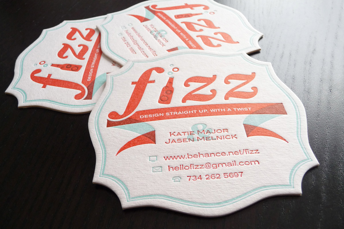
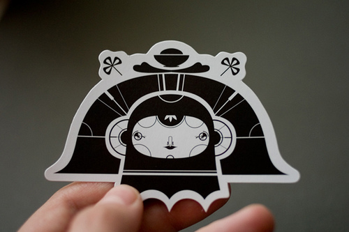
More than any handshake, your business card tells the people you meet what you’re all about. A well designed card can show off your seriousness, your stature, or your creativity . . . all with only a couple of subtle design choices. How you lay out your business card can make all the difference in a world where encounters with important people are often brief (and occasionally life changing). Your card is a lasting reminder of your personality for when you want to leave someone with a strong impression who you are and why you matter. This is doubly true if you’re leaving a card or two behind in a cafe or on a bulletin board as the sole representation of what you bring to the table and can add to the conversation.
Serious people take the way they are presented very seriously, especially people who actively craft a personal brand they want you to associate them with. And well crafted business cards show this off with simple, unspoken brilliance. Let’s take a look at some of the most important components.
1. Typography
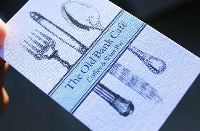
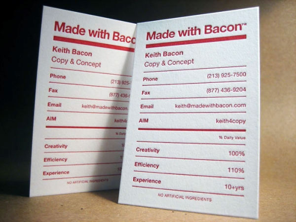
Aside from the information printed on the card, your typographical choice is among the most important decisions you make in your design. Typography is the science of lettering, particularly how a reader will engage with the written word when they look at letters on a page. In most instances, the lettering you choose will take up the majority of the space on your business card, and it is integral to conveying the information clearly and with the proper effect. Choosing more traditional lettering will convey seriousness and a conservative, businesslike approach, whereas selecting something hipper like Helvetica or literary like Garamond can flavor the recipient’s response to suit your aims.
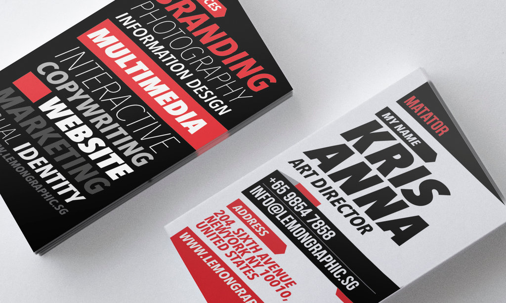
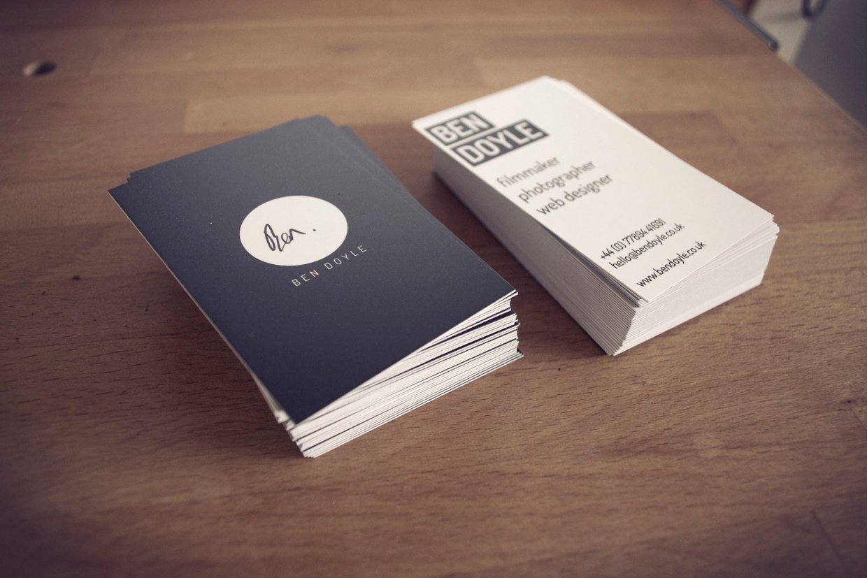
These typographic business card examples clearly illustrate the powerful effects of creative font choices:

Typographic Business Card Design by Jessica Hische. You can find more of her inspiring work at JessicaHische.is.
When choosing your font, there are a lot of important decisions to make, from the size to the style and color, and immeasurable insight can be gained by doing a little research before you make the big decision.
2. Logo
On the modern business card, there’s a lot of leeway when it comes to the logo. You can choose something classic and sophisticated like a simple crest or geometric form, or a full color illustration or photograph. Your logo can define the aesthetic of your business card, as well as the general feel of your business. Branding experts put a lot of importance on the need to create a strong, effective logo.
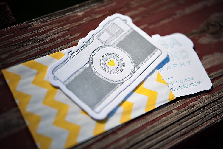
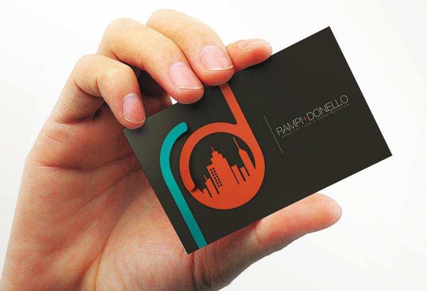
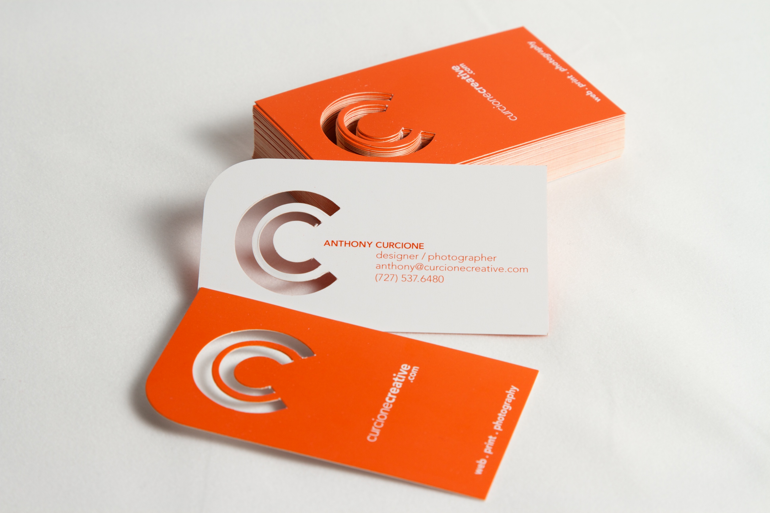
One way that you can creatively emphasize your logo is through die-cut printing. Here are some examples of how die-cut printing can draw the attention to your logos as well as add points to your card for creativity.
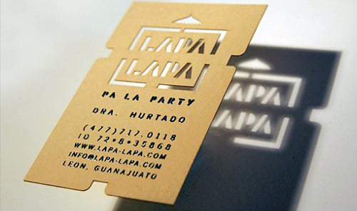
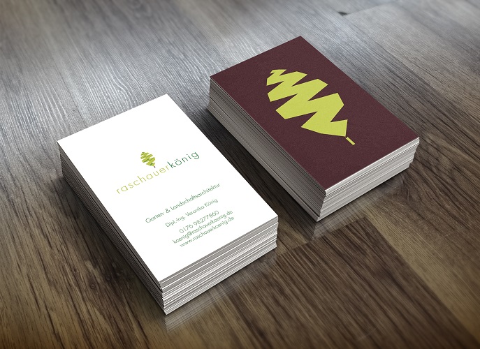
Palm Business Cards of Dra. Hurtado of Lapa Lapa, a company who makes shade structures from palm tree branches.
Your logo acts as the visual representation of what makes you and your product or services special. It’s also a great place to show off your personal style or make a trademark for yourself. Take, for example, Donald Trump’s signature scribbled autograph running thick across the top of his card. Next to the fairly conservative gold geometric form in the corner, this signed addition says more about how Trump runs things than anything else—in a big way . . . and with brashness. It’s certainly one way to make a lasting statement.
3. Paper
The quality of the paper you use says a lot about how much you care about details. Mohawk’s Paper Basics says it best: “Because paper affects the perceived quality of the finished piece, always use the best paper you can for the budget you have. In many jobs, the choice of a better paper adds considerably more to the quality of the outcome than it does to the cost.”
Before the internet revolutionized the way people find new jobs, the paper quality of your resume was a subtle indication of how serious you were about the job (and how professional you were as an employee). While you may not necessarily associate the sense of touch with curating job leads, it’s true that the thickness and texture of your paper will influence the feeling a recipient gets when they hold it in their hand. Subtle touches like beveled edging and watermarks can make your card stand out among all the others too. Personally, I love the look of a hand-pressed typeface on a thick, cottony paper—designed just so that the letters indent into the paper ever so slightly, creating a texture on the text itself.
When choosing a paper for home printing, you have the option of choosing a matte paper (for a traditional look) or glossy paper, which will bring out the sharpness of images better. For budget friendly printing, a 100 lb. gloss is a great option. For a professional look in a matte finish, a 14/16 point cardstock is great for getting the crispness you associate with a quality business card. You can also choose a printer-friendly specialty paper like Avery Two-Sided Clean Edge Business Card paper, which snaps off with clean edges giving you the professionally-done look from home.
If you aim to make a bigger, non-traditional statement with your business card, consider mulling over these next two elements in your design.
4. Creative Layout
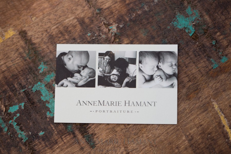
Business cards offer little room for designers to work with. As a result using color, white space, and proportion are extra important to your composition and how it reads. Putting too much information on your card can crowd out the important stuff, such as your contact info, whereas having too little can feel sparse and underwhelming. Thanks to modern print technologies, you have the option to lay the information on your card over a full color photograph or design, and selecting colors and images that compliment your composition will help attract the reader’s eye.
Using balance—and even having an understanding of the rule of thirds used in painting and photography—can open up a world of inspiration when assembling your layout.
If you don’t have a business card design ready yet, several online business card services can help you design a more non-traditional look. Our personal favorite for online business cards is Moo.com. Apart from their fresh and modern selection of pre-designed business card templates, you can also choose from their varied selection of business card sizes and shapes. TinyPrints.com is another source for tastefully designed business card templates that provide the option for standard, square, and folded business cards.
If you have a design all laid out and ready to go, you can also print from home—though if you want to include a lot of complex or rich images, the right tools are needed to help you get the desired effect. A printer that can produce photo quality images is good for this type of design, particularly inkjet models like the HP Photosmart 7520 printer. Also remember to make sure your ink reserves are fresh, as lifelike colors will lose their tonal quality when one of your printer ink colors is running low.
5. Shape
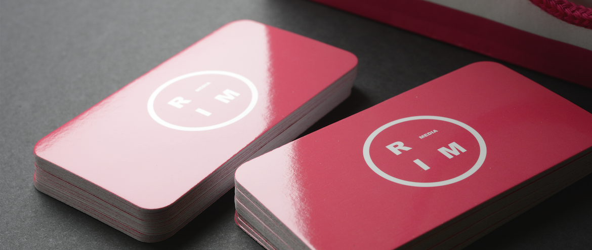
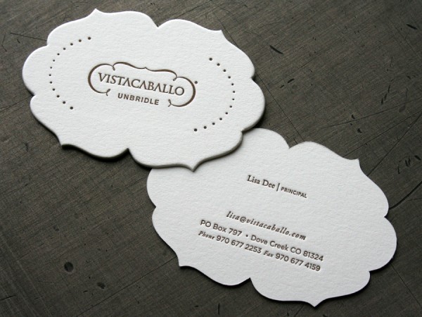
Business cards used to come in a couple very simple forms based around a standard size and rectangular shape. The design choices you had in print were fairly straightforward, limited by what you could feasibly assemble on a letterpress. Due to advances in printing and shifts in creative taste, business cards have been transformed to suit the imaginations of their designers.
Nowadays, it’s not at all uncommon to see micro-sized business cards or oversized cards designed to fold into creative shapes—business cards that engage the mind as well as the eye. Choosing a unique shape or size can help to make your business card stand out from all the rest and get the attention the recipient. In the age of the internet, text isn’t the only thing that can be “sticky” after all.
Just remember: the symmetry of your cards is important. Having a paper cutter around the home or office can make all the difference when you’re cutting business cards, as well as invitations, menus, and other paper products. It’s a small investment that will pay itself off quickly.
Whether you’re looking to stick with the traditional or make a radical statement of your uniqueness, crafting a smart and effective business card is a must. Breaking down your business card design and carefully planning each of the elements are the first steps towards designing a medium that will not only attract your audience’s attention but also leave a branded lasting impression they will remember you for.
